Why the “Lowest Jobless Claims Since 1969” Headline Is Only Half the Story
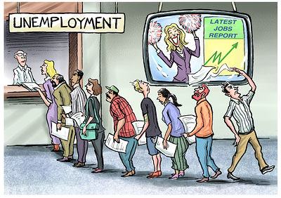
In July 2026, the White House posted a graphic celebrating weekly unemployment claims reaching their lowest level since 1969. It featured a bright arrow pointing at the number, a photo of the president looking pleased, and a headline designed to be shared rather than questioned.
Most people probably see a statistic like that and think: “It sure doesn’t feel like the job market is thriving.”
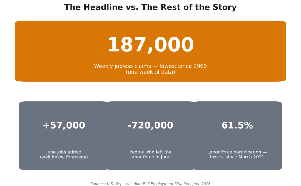
Here’s the interesting part: the 187,000 weekly jobless claims figure is real! The problem isn’t that the claim is false, it’s that it doesn’t paint the whole picture. Pull up the other charts on the very same government website, and a much different picture emerges, one that arguably matters far more to working people than a single flattering headline.
This isn’t a partisan gotcha. Every administration, regardless of party, has cherry-picked favorable numbers while downplaying less convenient ones. The point of this piece isn’t that “your side is wrong.” It’s that all of us, regardless of how we vote, should know how to look beyond a headline. Because the people producing these graphics are often counting on us not to.
What “Initial Claims” Actually Measures
Initial claims only count one thing: how many people filed for unemployment benefits for the first time that week. It says nothing about how many jobs were created, how many people gave up looking for work, or whether the people still employed can pay their bills. It’s one data point out of dozens the government publishes every month, and it’s also the one that swings around the most week to week — which is exactly why it’s easy to pick a single good week and hold it up as proof everything’s fine.
The Three Charts the Headline Left Out
All of this data lives on FRED, the Federal Reserve Economic Data website — the same public source the White House pulled its number from. Anyone can look at it for free.
Hiring has been unusually weak for months.
According to the Bureau of Labor Statistics’ June 2026 employment report, nonfarm payrolls grew by only 57,000 jobs that month — well short of the roughly 115,000 economists expected, and far below the 258,800 some forecasters projected. BLS also revised its earlier estimates for April and May downward, meaning the job market had already been performing worse than reported in real time. February 2026 was worse still: employers cut a net 92,000 jobs, one of the clearest monthly losses since the pandemic.

People are leaving the workforce, not finding jobs.
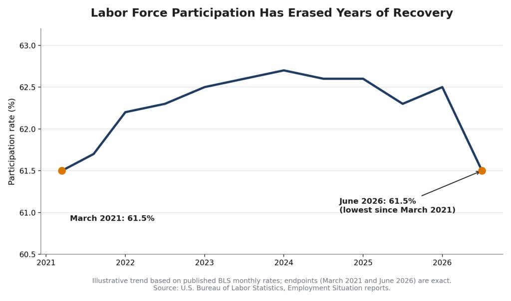
The labor force participation rate — the share of adults working or actively looking for work — fell to 61.5% in June 2026, its lowest level since March 2021. BLS reported this was a statistically significant drop of 720,000 people from the labor force in a single month, even as the overall adult population grew by 112,000 over the same period. In plain terms: the pool of available workers shrank not because people vanished, but because hundreds of thousands stopped counting themselves as part of the workforce at all.
The “falling unemployment rate” is doing something sneaky.
The unemployment rate dropped to 4.2% that same month. That sounds like good news, and headlines ran with it. But multiple independent analyses of the same BLS data — including coverage from CNBC and independent labor-market trackers — pointed out that the drop was driven mainly by people leaving the labor force, not by a surge in hiring. If you stop counting yourself as “looking for work,” you’re no longer counted as unemployed, even if you still don’t have a job. The unemployment rate can fall while the actual number of employed people barely moves.
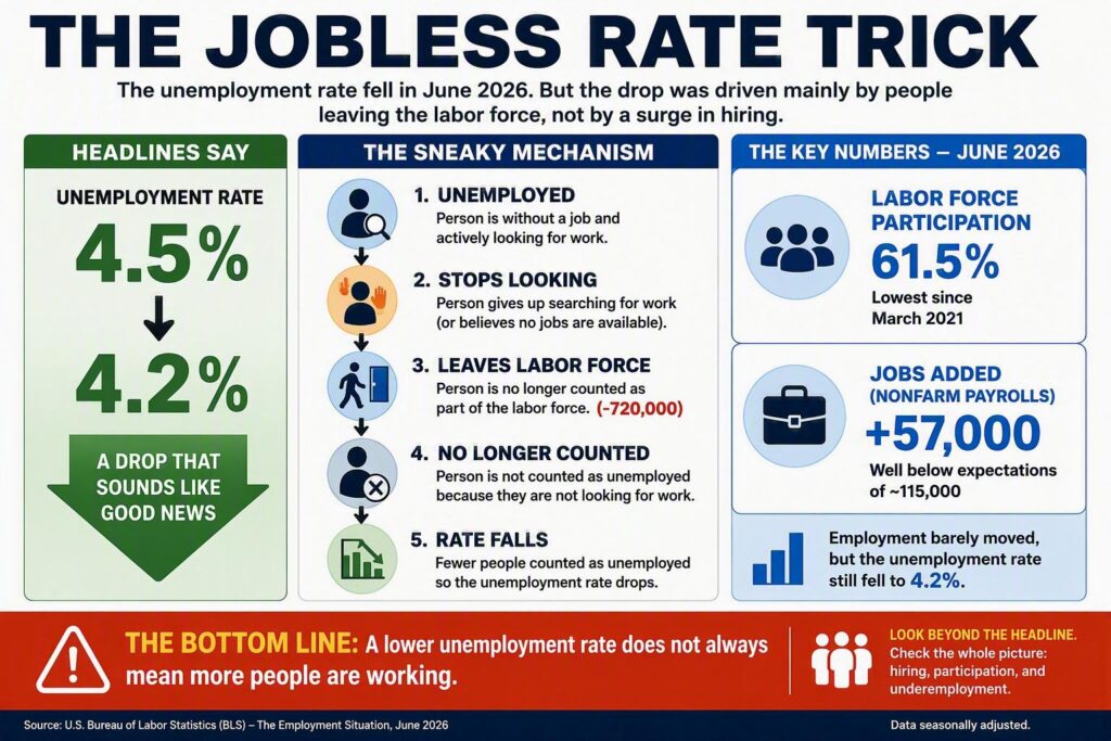
Put those three charts next to the “lowest since 1969” headline, and the story changes completely: hiring is sluggish and getting revised downward, hundreds of thousands of people are giving up the job search, and the flattering unemployment number is partly a byproduct of that exit — not stronger job creation.
Why This Matters More If You’re Working Paycheck to Paycheck
This isn’t an abstract statistics argument. For working people and the working poor, the gap between “the labor market is thriving” and “hiring has stalled and people are giving up” is the difference between:
- Whether you can realistically find a better-paying job or a second job if you need one
- Whether your current employer feels pressure to raise wages to keep you
- Whether the 4.7 million Americans BLS counts as working part-time only because they can’t find full-time hours will get relief
- Whether the “discouraged workers” the government counts separately — people who want a job but have stopped looking because they don’t believe one is available — are a shrinking group or a growing one
A misleading headline doesn’t just spin a news cycle. It can shape whether lawmakers feel political pressure to act on wages, job training, unemployment insurance, or labor protections at all. If the official story is “everything’s fine,” there’s less incentive to fix what isn’t.
In Fairness: What the Skeptics Get Right, Too
A hard-hitting piece should still be honest about the other side of the ledger:
- Low layoffs are a real, legitimate positive sign. Employers holding onto workers instead of cutting them is not nothing, and it does reduce the risk of a sudden spike in unemployment.
- Not all of the labor force decline is “discouraged workers” giving up. Some of it likely reflects an aging population moving into retirement and reduced immigration shrinking the pool of new workers — demographic shifts, not despair, account for part of the number.
Both things can be true at once: layoffs are genuinely low, and the labor market is genuinely weaker than the “lowest since 1969” headline implies. The honest read of the data holds both ideas at the same time instead of picking whichever one fits a narrative.
What You Can Actually Do With This
You don’t need an economics degree to check this yourself. FRED and BLS.gov are free, public, and don’t require login. When any political leader — of either party — posts a jobs number, you can look up the same source in a few minutes and ask: is this the only chart, or one out of several?
- Bookmark fred.stlouisfed.org and bls.gov/news.release/empsit.htm. These are the primary sources behind almost every jobs headline you’ll see.
- Ask your local and federal representatives — regardless of party — to address the whole picture: hiring trends, labor force participation, and underemployment, not just the unemployment rate.
- Share verified data, not just viral graphics. Misleading headlines spread faster when we forward them without a second look.
- Support wage transparency and job-training investment locally. These are the tools that actually respond to weak hiring and discouraged workers, regardless of which party is in office.
The numbers themselves aren’t political. How they get framed is. The fix isn’t picking a side — it’s refusing to let any side pick your understanding of the economy for you.
Sources
- U.S. Bureau of Labor Statistics, The Employment Situation — June 2026, bls.gov/news.release/empsit.htm
- U.S. Bureau of Labor Statistics, The Employment Situation — February 2026 (payroll decline), reported via CNBC, February 2026
- Federal Reserve Economic Data (FRED), Initial Claims (ICSA/ICNSA) series, fred.stlouisfed.org
- Bloomberg, “US Initial Jobless Claims Fall to Lowest Level Since 1969,” July 23, 2026
- CNN Business, “The number of Americans filing for unemployment is the lowest since 1969,” July 23, 2026
- CNBC, “Jobs report June 2026,” July 2, 2026
- Fiscal Lab on Capitol Hill, “The Fiscal Lab Jobs Report for June 2026”